webIIClass posts page 2

Stearns: Site wireframes

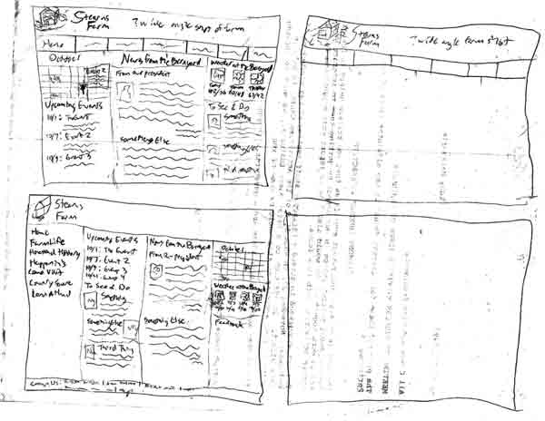
We made some wireframes for the planned layout of the Stearn’s site.  We were supposed to consider theme in these as well, but we all worked mostly on layout.

Stearns layout wireframe 1 I started with a few ideas in boxes that would later be moved to printed, properly proportioned boxes.  I liked the layout we had been working with in the wireframes we had done in that Oversite program, with the buttons along the top and sub navigation in the side bar, so I started with that.  In trying to make another type of  layout, I went with an accordion menu in a sidebar.
Stearns layout wireframe 2
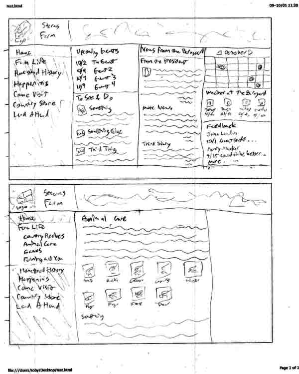
I then began moving the layouts to the properly sized boxes as “final” versions. This is the one with the button bar at the top, with a home page version and another page version that has the side sub navigation

Stearns layout wireframe 3
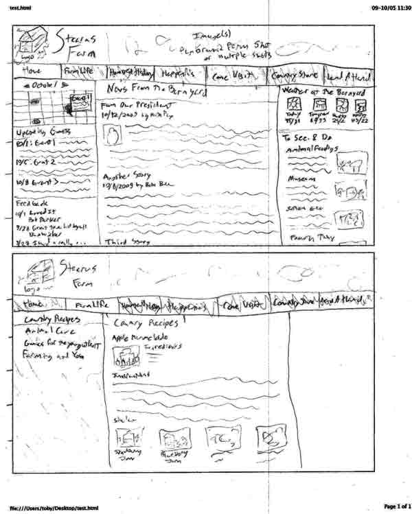
This is a slight change to the button bar layout with a shorter width top bar and the footer as part of the side bar. I only did one, as it was otherwise to be similar to the other button bar example.

Stearns layout wireframe 4
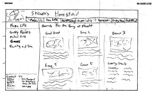
This is the accordion side bar layout. The four column home page is very busy, but I was trying to keep everything above the fold. It will probably drop a column and have some stuff drop below the fold in the future.


WordPress as CMS

I’ve been researching WordPress as a CMS for potential use on my own sites, but some of the information could certainly apply to the Stearn’s Farm project.

WordPress as CMS links:

I will update this post as I find more information and possibly pull out info from the links.

So far it is looking like WordPress will not work for my personal plans.  The main reason I was interested was the nice text editing features that I certainly would not be able to recreate myself, and of course the fact that I potentially wouldn’t need to write that much to have a continuously update CMS.  But it seems like it would be a lot of work to get it to do what I want it to.

[update] The text editor used in WordPress is called TinyMCE which seems to be a seperate project that can be integratable into any site.  I may build out my own sites but include TinyMCE as an editing option.[/update]


Stearn’s Personas

We developed three personas for the Stearn’s Farm website.  They are generic people representing the most likely visitors to the site, and will be used to make decisions in site creation.  The appearance of the site should target these personas.  Content prevalent to these personas should be emphasized, and content decisions should be made with them in mind.  In general, the site should target these personas, though it should still be usable by others.

Our three personas are:  Teachers, Parents, and History buffs.

Teachers

Local and area teachers from preschool to maybe 4th grade might be interested in the farm for field trips.  Education of children is probably the farm’s biggest draw.

Needs

  • cost
  • hours
  • map and directions
  • attractions/things to do
  • tour visit info, including:
    • materials available
    • if tour is guided
    • picnic tables
    • bus info
    • bathroom info
    • safety info

Parents

Local and area parents and grandparents searching for something to do with their kids or grandkids might be interested in the farm.  Parents from Parma will be the most interested.  Parents interested in green things or from the inner city might also be especially interested.  Females are probably the most likely to be visiting the site.

Needs

  • cost
  • hours, especially the best times to visit
  • map and directions
  • nearby attractions
  • parking information
  • attractions/things to do

History buffs

History buffs from Parma or those interested in farms might be interested in the farm and site.

Needs

  • history of the farm
  • historic sites in the area
  • other Parma history

Stearn’s Research: Food for historians

We identified history buffs as one of the probable main visitors to the Stearn’s site.  We want to list local attractions on the site, so I am researching eateries that history buffs might be interested in.

Here is a list of Parma eateries.  I’m not sure if there are any historical places in that list, but I’m sure most of them would be places that a history buff would be happy to eat at.

Possible Restaurants

Unfortunately, it is very hard to find historic restaurants in Parma with a search engine, so that is the best I can do.


    Stearns Farm Meeting 1

    We had our first meeting with our client contact for our Stearns Farm project.  She (Debbie) was very nice and the meeting went quite well.  We got a much better concept of what we will be doing with the site.  We also found that the site will be made completely new on whatever hosting we care to put it on:  It is not tied to being served from the Parma site as the old “site” was.  So the project looks like it will be interesting and fun, and we’ll be able to do a lot with it.  I think it will be a huge improvement for the farm’s web presence as well, and we should hopefully be able to increase both visits and donations to the farm.

    We determined for sure that it is a 501(c)3 non-profit.  I’ve worked on a number of non-profit websites (including Red-Cross of Greater Cleveland, Humane Society of Greater Akron, and OROC) well an intern at RPM International.  Hopefully, I’ll be able to use some of my experience from there to help this project.


    Full WordPress Blog

    We set up the full version of WordPress (from wordpress.org) for learning how to work with it. Mine can be found here.  I’ve already had experience working with the full version of wordpress (I’ve used it for years on my own site), but I haven’t gotten too far working with the themes.  I’ve taken this opportunity to make a theme nearly from scratch.  I’ve used the Sandbox theme, deleting all CSS but leaving the html/php templates.  I’ve considered modifying those as well, as I don’t like everything about them and I may need to to get the site to work as desired.

    Anyway, I’ve created a semi-fluid centered layout there using absolute positioning within a div.  I’ve been wanting to do something like this to allow the navigation and other non-main content to be placed at the bottom of the page structurally but still where I want it for appearance.

    It works fairly nicely, though it still has some problems.  For instance, padding on any of the absolutely positioned boxes expands them and messes up the layout.  Any padding must be done on sub-elements.  Borders on any of the main blocks don’t work either, and can cause layout problems.  And since the side columns are absolutely positioned and take up no height, I need a min-height to ensure all of their content doesn’t float out of their box.  I hope to continue working on the theme to correct these problems, and may use something similar for my own website.

    I recently (re)read about elastic layouts.  I find the idea to be good for usability:  The whole site scales when the text size changes.  So I’ve considered changing the theme to work completely based on em’s for sizing, except I’d have to use a workaround for the full image header.  Strangely though it seems most newer browsers can scale any site almost as if they were already elastic:  With the aforementioned theme, IE 7, Firefox 3.5, and Safari 4 scale the whole page, including the header image and pixel width sidebars, down or up just fine and even maintain line lengths through part of the scaling.  Currently the page is 100% width unless the browser goes wider than its max-width, so I’d try to keep that if going to em’s.

    The theme hasn’t been tested in IE 6 yet, since I don’t think I have a copy:  I may have to use a virtual version or another computer.  I imagine it will fail miserably there.  I haven’t yet delved into the conditional stylesheets, but I may add one just for IE 6 if the site doesn’t work well with it.

    I can’t figure out how to apply this theme to this wordpress.com blog.  It seems like it may cost money to do.  I’ll have to investigate further.  I may end up moving this blog for the class over there, maybe converting this into a personal blog.


    Questions to ask the client

    In this class, we will be working on updating the site for a historical farm in the area.  We are coming up with questions to ask them about the site we will build for them. We must use these questions to find out their needs effectively. To do se we need to be good communicators.

    Questions should uncover:

    • Target Audience
    • Style
      • Examples: Get examples of 3 sites they like or would be what they are going for
      • Branding: logo, colors, etc that the organization uses to identify itself
    • Content
      • Priorities for content, functionality
      • Objectives
      • who will provide writing, images
    • Technology and hosting
      • Cost
      • Database
      • Scripting
      • other features
    • Target audience
    • Dollars
    • Timeline
    • Peers & Competition

    Historic Sites

    I am taking a look at some historic sites and deciding what I like and dislike about them.  The sites are:

    Hale Farm

    Hale Farm and Village was the first historic place I thought of.  I’ve been there before and it is fairly nearby where I live.

    The site is a sub-site of the Western Reserve Historical Society.  This makes it more easy to find other historical places in the area, but gives Hale Farm less emphasis.  Some of the content bleeds together.  I think it could have a lot more information about what is at the farm.  The site is kept very up to date.  It has a fair amount of event and news related content.  There is an online donation function, though it doesn’t seem as extensive as many other non-profits:  I’m not sure if this is because they are less dependent on donations or get enough from other methods or what.  There is perhaps what is going to become on online store, but it is not functional currently:  It has a shopping cart, but no way to add anything to it.

    Peninsula Historic Museum

    A single page on the Peninsula Library site discusses the museum.  The museum is relatively small and new, so I suppose this is to be expected.  A basic description, location, hours, and basic exhibit descriptions are all the content.  I like that there are descriptions of the exhibits, though there could certainly be a more in-depth description of the museum itself, including perhaps a history.  A link on the page goes to another site where you can view some of the museums images, but the link only goes to the root URL of that site, and it tells you to search for the images:  it would be nice if they could have a link to their stuff straight off.  It’d also be nice if they actually seemed to have images there.

    There is no dynamic content on this page, though the main site has a lot more happening, such as events, donations, and a good bit of information about the other stuff the library does (including all that book stuff).  The menu is somewhat annoying to use.  It has a top level set of items that don’t go anywhere, but open up a set of other links to click.  The links aren’t actual links, probably flash buttons, so they give no tells of the underlying URL or whether they are to an external site.

    Cuyahoga Valley Scenic Railroad

    This site is not a sub-site of others, giving the item of interest a lot of emphasis.  There are advanced data driven features such as event listings, news, a calendar, and even a membership section.  Some of the stuff that is nested in sub-sections of the site can be hard to find perhaps, especially with no search available.