Stearns posts page 2

Stearns Site Design Mockups

Over the past couple weeks we’ve been working on our mockups for the site design for Stearns. We each picked one or two of our wireframe concepts and have used Adobe Photoshop or Fireworks to create the fleshed out, full color and image versions of them.

I used Photoshop, since I’m familiar with it and have never dealt with Fireworks before (hadn’t even heard of it till this class).  As a non-designer, it took me a long time to do.  I tried to keep every piece separate and organized to make it fully modifiable.  This can be painful in Photoshop though, especially since you can’t modify some aspects of multiple layers at once.  And with all those little bits, they really bogged down even the powerful computers at school at times.

My version of Photoshop at home is old (7), so I couldn’t really work on them there.  Some of the stuff from CS4 didn’t fully translate, I don’t have all the fonts, and Photoshop 7 didn’t have the nested layer groups and other benefits that I was heavily using to keep organized and work on this thing.  I had to spend extra time at school and at my parents (my Mom has CS4).

Next time, I think I’ll be faster at this, as I know more what I’m doing, how to deal with all those pieces and what not.  Hopefully also I’ll be better at making a good design.  I’d like to learn that Fireworks, as it looks much better for this purpose.  I think it even makes it very easy to convert the mockup into actual HTML and CSS for the live site, which could save a lot of time with that.

So finally, my mockups.  I did two of my ideas, plus a modification of the one.  There are two pages for each.  They all have very similar (copied and then slightly modified) content sections.  They were all designed to be about 975 pixels wide and with 600 pixels as the above the fold height.  They have an additional 200 pixels of width to show the sides and as much as 600 pixels below the fold of height for content.


Stearns: Thematic Wireframes

After making our layout wireframes, we brainstormed some various thematic ideas.  We mostly thought of items that’d be on a farm.  Some of the ideas that were popular were: wood grain, hanging signs, the historical sign, barn, sun, etchings, grass, farm animals, silo, straw hat, pitch fork, seasonal changes, red, brown, and trees.  It was a brainstorm, so there were many other ideas, although some were less applicable.

In class, we each drew up one or a few quick thematic wireframes.  We didn’t have much time, so many weren’t fleshed out.  I drew three:

Stearns thematic wireframe 1

These two were based mainly on the historic mark sign that the farm has. The first had many little signs for top buttons and logo, two big signs for a sidebar and main content area, and then a grassy ground below that serves as a footer. The page background would be a blue sky. I felt this might be a little overboard with the signs, but liked the grassy footer and blue sky a lot, using them in most of my designs. The next drawing kept the footer and had one sign as a sidebar with the logo and accordion navigation. I included the wagon wheel that is at the base of the Stearn’s sign. I felt a light red barn side or white slatted house side would work for the main content area.

Stearns  thematic wireframe 5

My other drawing used faded wood signs for everything. I wanted an etching on the top banner for the logo and a burn in look for the banner text. The main content and side bar would be place on parchment nailed to a giant sign. All of the signs are hanging and hang from each other.

We were then given a couple days to create some more.

Stearns thematic wireframe 2

This one would have barn red as the body background with an open barn door holding the main content. I wasn’t sure how to handle the content, so I figured a fairly normal div box set would work if I couldn’t think of anything else. The top banner would be a wood sign over the door with an etching of the farm, burn in title, and silhouettes of animals with white lettering for the main navigation. I continued with the grass footer.

Stearns thematic wireframe 3](https://www.tobymackenzie.com/_/wp-content/uploads/2009/10/scan0002_2.jpg)
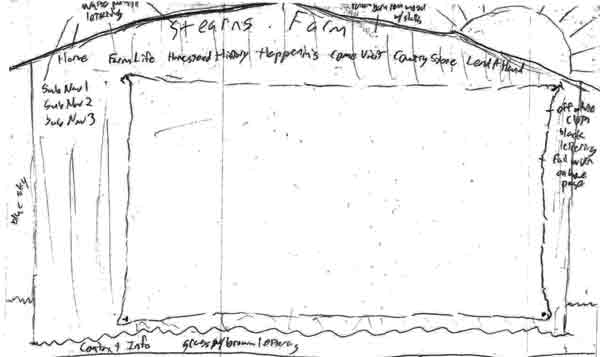
Next up I made the back of a red barn. The roof would hold the title (probably no room for a logo) and the main navigation in white paint-like lettering. The sub navigation would be in a side bar with the same lettering. The main content would be on a big off white type cloth nailed to the barn. The footer would again be the grass. A sun was featured over the roof to add a little brightness.

Stearns thematic wireframe 4

Finally, I came up with a variant of the barn door idea with something inside. A farmer would be standing with a pitch fork forking a large, squarish pile of hay. The hay would hold the main content and the farmer would have the accordion side navigation on his back/side. This version of the door had a cloth banner nailed across the inside top of the door with just the logo and title. This one seemed very kiddy to me though, would probably only appeal to kids.


Stearns: Site wireframes

We made some wireframes for the planned layout of the Stearn’s site.  We were supposed to consider theme in these as well, but we all worked mostly on layout.

Stearns layout wireframe 1 I started with a few ideas in boxes that would later be moved to printed, properly proportioned boxes.  I liked the layout we had been working with in the wireframes we had done in that Oversite program, with the buttons along the top and sub navigation in the side bar, so I started with that.  In trying to make another type of  layout, I went with an accordion menu in a sidebar.

Stearns layout wireframe 2
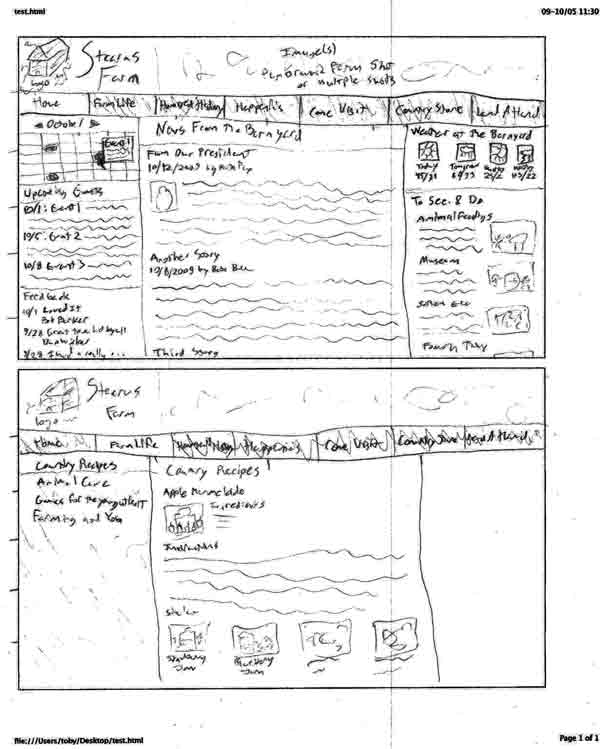
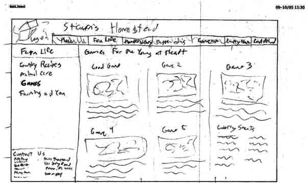
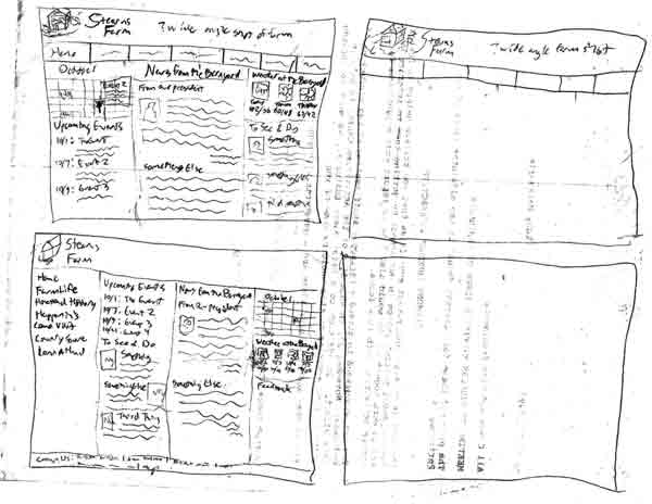
I then began moving the layouts to the properly sized boxes as “final” versions. This is the one with the button bar at the top, with a home page version and another page version that has the side sub navigation

Stearns layout wireframe 3
This is a slight change to the button bar layout with a shorter width top bar and the footer as part of the side bar. I only did one, as it was otherwise to be similar to the other button bar example.

Stearns layout wireframe 4
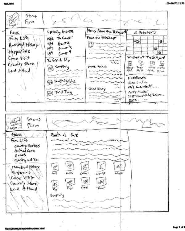
This is the accordion side bar layout. The four column home page is very busy, but I was trying to keep everything above the fold. It will probably drop a column and have some stuff drop below the fold in the future.


WordPress as CMS

I’ve been researching WordPress as a CMS for potential use on my own sites, but some of the information could certainly apply to the Stearn’s Farm project.

WordPress as CMS links:

I will update this post as I find more information and possibly pull out info from the links.

So far it is looking like WordPress will not work for my personal plans.  The main reason I was interested was the nice text editing features that I certainly would not be able to recreate myself, and of course the fact that I potentially wouldn’t need to write that much to have a continuously update CMS.  But it seems like it would be a lot of work to get it to do what I want it to.

[update] The text editor used in WordPress is called TinyMCE which seems to be a seperate project that can be integratable into any site.  I may build out my own sites but include TinyMCE as an editing option.[/update]


Stearn’s Personas

We developed three personas for the Stearn’s Farm website.  They are generic people representing the most likely visitors to the site, and will be used to make decisions in site creation.  The appearance of the site should target these personas.  Content prevalent to these personas should be emphasized, and content decisions should be made with them in mind.  In general, the site should target these personas, though it should still be usable by others.

Our three personas are:  Teachers, Parents, and History buffs.

Teachers

Local and area teachers from preschool to maybe 4th grade might be interested in the farm for field trips.  Education of children is probably the farm’s biggest draw.

Needs

  • cost
  • hours
  • map and directions
  • attractions/things to do
  • tour visit info, including:
    • materials available
    • if tour is guided
    • picnic tables
    • bus info
    • bathroom info
    • safety info

Parents

Local and area parents and grandparents searching for something to do with their kids or grandkids might be interested in the farm.  Parents from Parma will be the most interested.  Parents interested in green things or from the inner city might also be especially interested.  Females are probably the most likely to be visiting the site.

Needs

  • cost
  • hours, especially the best times to visit
  • map and directions
  • nearby attractions
  • parking information
  • attractions/things to do

History buffs

History buffs from Parma or those interested in farms might be interested in the farm and site.

Needs

  • history of the farm
  • historic sites in the area
  • other Parma history

Stearn’s Research: Food for historians

We identified history buffs as one of the probable main visitors to the Stearn’s site.  We want to list local attractions on the site, so I am researching eateries that history buffs might be interested in.

Here is a list of Parma eateries.  I’m not sure if there are any historical places in that list, but I’m sure most of them would be places that a history buff would be happy to eat at.

Possible Restaurants

Unfortunately, it is very hard to find historic restaurants in Parma with a search engine, so that is the best I can do.


    Stearns Farm Meeting 1

    We had our first meeting with our client contact for our Stearns Farm project.  She (Debbie) was very nice and the meeting went quite well.  We got a much better concept of what we will be doing with the site.  We also found that the site will be made completely new on whatever hosting we care to put it on:  It is not tied to being served from the Parma site as the old “site” was.  So the project looks like it will be interesting and fun, and we’ll be able to do a lot with it.  I think it will be a huge improvement for the farm’s web presence as well, and we should hopefully be able to increase both visits and donations to the farm.

    We determined for sure that it is a 501(c)3 non-profit.  I’ve worked on a number of non-profit websites (including Red-Cross of Greater Cleveland, Humane Society of Greater Akron, and OROC) well an intern at RPM International.  Hopefully, I’ll be able to use some of my experience from there to help this project.