The min-content in CSS grid apparently takes into account the full width of a <pre> element content, even if you put max-width: 100%; on it.
layout posts
CSS: inner border grid list with grid layout
A couple years ago, I wrote a post titled “CSS: Inner Border Grid List” about solutions to a problem I was having. The post is not about CSS grid layout, but recent interest in the post leads me to believe people are visiting expecting it to be. In the interest of serving those visitors, I decided to create a solution using the now well supported spec.
Continue reading post "CSS: inner border grid list with grid layout"My first responsive site
I’ve been interested in the basic idea of responsive design since I first started into web development. Back then it was mainly limited to flexible widths that accommodated changing screen widths and font sizes. I experimented with that when development was just a hobby. Still, I found CSS2 and browser compatibility issues to greatly limit the flexibility. When starting to actually get paid as a developer, I went with what was already being done at the places I worked, which was pixel-perfect design. Sites had to work in old browsers and time was limited. Designs were flat images that were easy to cut up and use CSS to match exactly. I did play with some flexibility when I had more free time.
When responsive design became a thing, I thought it looked pretty awesome. It gave a lot more flexibility than what I had been playing with. Still, browser support was too bad for parts of it for me to use at work. I played with some aspects of it, adding a bit of flexibility here and there, but still kept mostly with the pixel perfect type design. When we eventually discussed it with my boss, he didn’t like the idea, particularly for accommodating his designs and the browser support issues. I started a yet unfinished remake of my own site that allowed me to play much more, but didn’t get very far towards a finished design.
The Site
Recently, my boss came up with a simple design for a simple site that he thought would be perfect for trying responsive techniques with, the annual report for the Gay Community Fund. It lent itself well to flexibility and him and the client were fine with graceful degradation / progressive enhancement. It consists of basically two layouts: the home page, with a gallery layout of boxes; and an internal layout with a heading, a possible image, a possible small image gallery, and a possible long list.
Continue reading post "My first responsive site"IE 10 and CSS Grid Layout
IE 10 has recently graduated from beta and is now the current official release. It started out Windows 8 only, but now is available on 7 as well as a preview release. Hopefully that will allow it to grab more IE users quickly. IE, which has long been the bane of web developers, has been getting better and better with each release. IE 6 has always been a pain to develop for, having many bugs/quirks in rendering pages. In all but fairly simple sites, it always took me a fair amount of time to fix after getting things looking right in other browsers. Luckily, the market share is low enough that at work we don’t even worry about it anymore. IE 7 was better. Using a subset of HTML4/CSS2 level development, I usually have had to do only minor tweaks unless the sites were fairly complex. Luckily, It’s share is almost to the cutoff point where we stop developing for it as well. With IE 8, I’ve been able to do most HTML4/CSS2 level stuff without worries. display: inline-block;, :before, :after, onhashchange, etc. It still remains a limiter in using some selectors and in making use of HTML5/CSS3 level techniques, though using an HTML5 shiv and CSS3 PIE or allowing for progressive enhancement to skip over some features in it works rather well. IE 9 has brought some HTML5/CSS3 stuff to the table, like selectors, HTML5 semantic elements, SVG, though it’s missing some important ones, like CSS3 columns and HTML5 form stuff. Since I develop to support IE 8 usually without browser specific tweaks, IE 9 basically works automatically, and has some style enhancements over 8.
And now there’s IE 10. IE 10 has added a lot more and is finally coming close to other browsers in implementing the not-yet-fully-standardized standards. It’s still missing some good ones, but the list of things that have to be skipped, worked around, etc, for IE’s current version has shrunk a good bit. It even implements some features that others haven’t yet.
The big one is the CSS3 grid layout module, which is the one I’m most excited about for the future. This module is pretty close to allowing for a real decoupling of markup from style that CSS has promised finally for page layout.
Continue reading post "IE 10 and CSS Grid Layout"Samba: Mockups in HTML
In building a website for a client, one usually builds clients, one usually builds a few mockups with different themes to give the client an idea of what the site will look like with one of a few options. They can tell the designer what changes they want, which can be made relatively easily to the mockup before the theme is actually built for the site.
The mockups are supposed to be quick and easy to build and modify, allowing designers to avoid dealing with all of the nuances of CSS and HTML at this early stage. Designers shouldn’t be held to any limits at this point: They design what they think the site should look like, and figure out how to build it later.
Traditionally, this might have been done in Photoshop. The layout would later be cut up and positioned on the site with CSS. I did three mockups for the Stearns Homestead project in Photoshop. They were a pain, with maybe a hundred layers to handle two pages of the site for each mockup. Managing multiple elements of the same type is not easy there. Photoshop doesn’t allow any easy management of multiple blocks of typography at once, so changes are difficult. Now that I’m not using school computers, I don’t have access to a newer version of Photoshop, and none of my image editors have layer folders or some other useful features, which had helped me out a lot.
Continue reading post "Samba: Mockups in HTML"Stearns: Two Content Columns Per Page
Our layout has some pages with a three column layout and some pages with only two columns. The left column is always the same, but the other two will have one or two columns based on individual page content. For a while, we’ve had the third column on the home page and an empty third column on other pages, but we ran into troubles when we wanted to add the third column content to the other pages.
The columns use float to get their positioning and can’t be inside each other or the text from one would flow under the other. A few options came to mind. We tried closing template divs and opening others in the HTML editor of the page content: this did not work for us, somehow removing the background that was supplied by a wrapper. It would be trouble for Stearns anyway. We also tried removing the container for the center column from the template and putting one div into two column pages, two into three column pages. This gave some difficulties with the editor, would require the divs on every page, and would be difficult for Stearns and us to work with.
Continue reading post "Stearns: Two Content Columns Per Page"Stearns Site Design Mockups
Over the past couple weeks we’ve been working on our mockups for the site design for Stearns. We each picked one or two of our wireframe concepts and have used Adobe Photoshop or Fireworks to create the fleshed out, full color and image versions of them.
I used Photoshop, since I’m familiar with it and have never dealt with Fireworks before (hadn’t even heard of it till this class). As a non-designer, it took me a long time to do. I tried to keep every piece separate and organized to make it fully modifiable. This can be painful in Photoshop though, especially since you can’t modify some aspects of multiple layers at once. And with all those little bits, they really bogged down even the powerful computers at school at times.
My version of Photoshop at home is old (7), so I couldn’t really work on them there. Some of the stuff from CS4 didn’t fully translate, I don’t have all the fonts, and Photoshop 7 didn’t have the nested layer groups and other benefits that I was heavily using to keep organized and work on this thing. I had to spend extra time at school and at my parents (my Mom has CS4).
Next time, I think I’ll be faster at this, as I know more what I’m doing, how to deal with all those pieces and what not. Hopefully also I’ll be better at making a good design. I’d like to learn that Fireworks, as it looks much better for this purpose. I think it even makes it very easy to convert the mockup into actual HTML and CSS for the live site, which could save a lot of time with that.
So finally, my mockups. I did two of my ideas, plus a modification of the one. There are two pages for each. They all have very similar (copied and then slightly modified) content sections. They were all designed to be about 975 pixels wide and with 600 pixels as the above the fold height. They have an additional 200 pixels of width to show the sides and as much as 600 pixels below the fold of height for content.
Stearns: Thematic Wireframes
After making our layout wireframes, we brainstormed some various thematic ideas. We mostly thought of items that’d be on a farm. Some of the ideas that were popular were: wood grain, hanging signs, the historical sign, barn, sun, etchings, grass, farm animals, silo, straw hat, pitch fork, seasonal changes, red, brown, and trees. It was a brainstorm, so there were many other ideas, although some were less applicable.
In class, we each drew up one or a few quick thematic wireframes. We didn’t have much time, so many weren’t fleshed out. I drew three:
These two were based mainly on the historic mark sign that the farm has. The first had many little signs for top buttons and logo, two big signs for a sidebar and main content area, and then a grassy ground below that serves as a footer. The page background would be a blue sky. I felt this might be a little overboard with the signs, but liked the grassy footer and blue sky a lot, using them in most of my designs. The next drawing kept the footer and had one sign as a sidebar with the logo and accordion navigation. I included the wagon wheel that is at the base of the Stearn’s sign. I felt a light red barn side or white slatted house side would work for the main content area.
My other drawing used faded wood signs for everything. I wanted an etching on the top banner for the logo and a burn in look for the banner text. The main content and side bar would be place on parchment nailed to a giant sign. All of the signs are hanging and hang from each other.
We were then given a couple days to create some more.
This one would have barn red as the body background with an open barn door holding the main content. I wasn’t sure how to handle the content, so I figured a fairly normal div box set would work if I couldn’t think of anything else. The top banner would be a wood sign over the door with an etching of the farm, burn in title, and silhouettes of animals with white lettering for the main navigation. I continued with the grass footer.
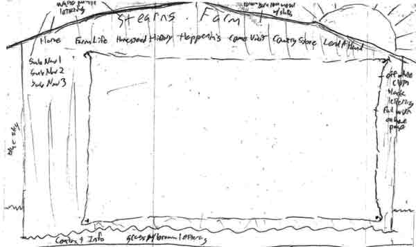 ](https://www.tobymackenzie.com/_/wp-content/uploads/2009/10/scan0002_2.jpg)
Next up I made the back of a red barn. The roof would hold the title (probably no room for a logo) and the main navigation in white paint-like lettering. The sub navigation would be in a side bar with the same lettering. The main content would be on a big off white type cloth nailed to the barn. The footer would again be the grass. A sun was featured over the roof to add a little brightness.
Finally, I came up with a variant of the barn door idea with something inside. A farmer would be standing with a pitch fork forking a large, squarish pile of hay. The hay would hold the main content and the farmer would have the accordion side navigation on his back/side. This version of the door had a cloth banner nailed across the inside top of the door with just the logo and title. This one seemed very kiddy to me though, would probably only appeal to kids.
Stearns: Site wireframes
We made some wireframes for the planned layout of the Stearn’s site. We were supposed to consider theme in these as well, but we all worked mostly on layout.
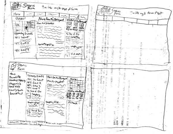 I started with a few ideas in boxes that would later be moved to printed, properly proportioned boxes. I liked the layout we had been working with in the wireframes we had done in that Oversite program, with the buttons along the top and sub navigation in the side bar, so I started with that. In trying to make another type of layout, I went with an accordion menu in a sidebar.
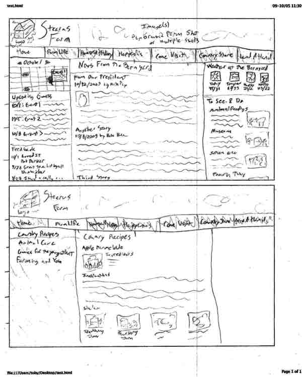
I then began moving the layouts to the properly sized boxes as “final” versions. This is the one with the button bar at the top, with a home page version and another page version that has the side sub navigation
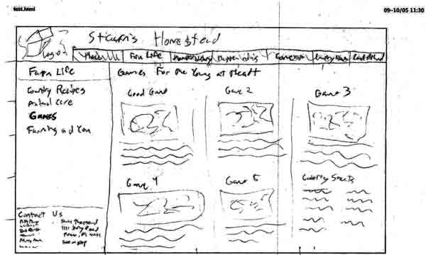
This is a slight change to the button bar layout with a shorter width top bar and the footer as part of the side bar. I only did one, as it was otherwise to be similar to the other button bar example.
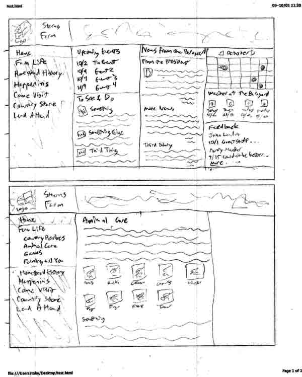
This is the accordion side bar layout. The four column home page is very busy, but I was trying to keep everything above the fold. It will probably drop a column and have some stuff drop below the fold in the future.
Full WordPress Blog
We set up the full version of WordPress (from wordpress.org) for learning how to work with it. Mine can be found here. I’ve already had experience working with the full version of wordpress (I’ve used it for years on my own site), but I haven’t gotten too far working with the themes. I’ve taken this opportunity to make a theme nearly from scratch. I’ve used the Sandbox theme, deleting all CSS but leaving the html/php templates. I’ve considered modifying those as well, as I don’t like everything about them and I may need to to get the site to work as desired.
Anyway, I’ve created a semi-fluid centered layout there using absolute positioning within a div. I’ve been wanting to do something like this to allow the navigation and other non-main content to be placed at the bottom of the page structurally but still where I want it for appearance.
It works fairly nicely, though it still has some problems. For instance, padding on any of the absolutely positioned boxes expands them and messes up the layout. Any padding must be done on sub-elements. Borders on any of the main blocks don’t work either, and can cause layout problems. And since the side columns are absolutely positioned and take up no height, I need a min-height to ensure all of their content doesn’t float out of their box. I hope to continue working on the theme to correct these problems, and may use something similar for my own website.
I recently (re)read about elastic layouts. I find the idea to be good for usability: The whole site scales when the text size changes. So I’ve considered changing the theme to work completely based on em’s for sizing, except I’d have to use a workaround for the full image header. Strangely though it seems most newer browsers can scale any site almost as if they were already elastic: With the aforementioned theme, IE 7, Firefox 3.5, and Safari 4 scale the whole page, including the header image and pixel width sidebars, down or up just fine and even maintain line lengths through part of the scaling. Currently the page is 100% width unless the browser goes wider than its max-width, so I’d try to keep that if going to em’s.
The theme hasn’t been tested in IE 6 yet, since I don’t think I have a copy: I may have to use a virtual version or another computer. I imagine it will fail miserably there. I haven’t yet delved into the conditional stylesheets, but I may add one just for IE 6 if the site doesn’t work well with it.
I can’t figure out how to apply this theme to this wordpress.com blog. It seems like it may cost money to do. I’ll have to investigate further. I may end up moving this blog for the class over there, maybe converting this into a personal blog.


