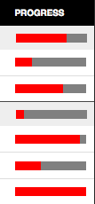
I decided to attempt to use another new HTML 5 element on a site, the <progress> element. This element is used to show the completed progress of a task, perfect for the tasks in a project management application we are making at Cogneato. I wanted it to have the same appearance for all modern browsers, a visual bar indicating percentage complete of a fixed width total bar. As always, this required some special handling for different browsers. Because of the complications, I needed to output different markup for different browsers, so I made a PHP function using server side browser sniffing to give me the proper output. The convoluted function looks like this:
<?php
$glbProgressWidthModifier=0.8;
function generateProgress($value){
    global $glbProgressWidthModifier, $ischrome, $issaf, $isie, $isie9;
    $value = $value * 100;
    ob_start();
?>
<?php if(!$ischrome){ ?><div class="progresswrap">progress  value="" max="100" class="elmprogress" style="width:px;"><span>%</span>></div><?php } ?>
<?php
    $fncReturn = ob_get_contents();
    ob_end_clean();
    return $fncReturn;
}
with a global width modifier to set the width of the total bar, where 1 means 100px, and various is… variables set elsewhere based on the sniffed browser. It will return the HTML output given a numeric value between 0 and 1 representing percentage complete, like echo generateProgress(0.85).
The styling looks like this:
.progresswrap{
    width: 80px; /* total bar width for non-chrome */
    height: 10px;
    background: gray;
}
progress, .elmprogress{
    display: block;
    width: 80px; /* total bar width for chrome */
    height: 10px;
    background: red;
}
progress span, .elmprogress span{
    display: none;
    font-size: 10px;
}
The span holds a textual representation displayed for non-CSS and old browsers, hidden for modern browsers. Chrome is the only browser that currently automatically shows the two bars as desired for progress elements displayed as block, so it just gets the progress element. Unfortunately, the colors this way are wrong: Green is always the percentage and the progress background is the total. Since it always does this for the background of a block progress element, there is no way around this unless you don’t use the progress element. For other browsers, I needed to create the effect with two separate block level elements, one for the total bar and one for the progress part. The inner block width is set inline based on percentage complete, while the outer is always the same width. Firefox and Opera handle the <progress> element like a span, so I use that as the inner block. Safari for some reason doesn’t allow the element inside of a <div> and removes it, but not its contents, completely from the DOM, so I serve it a <div> instead. This is also what I serve to IE, avoiding the need for a JavaScript hack to style the <progress> element. I gave IE9 the progress element, though I’m not sure how it is handled there.