After making our layout wireframes, we brainstormed some various thematic ideas. We mostly thought of items that’d be on a farm. Some of the ideas that were popular were: wood grain, hanging signs, the historical sign, barn, sun, etchings, grass, farm animals, silo, straw hat, pitch fork, seasonal changes, red, brown, and trees. It was a brainstorm, so there were many other ideas, although some were less applicable.
In class, we each drew up one or a few quick thematic wireframes. We didn’t have much time, so many weren’t fleshed out. I drew three:
These two were based mainly on the historic mark sign that the farm has. The first had many little signs for top buttons and logo, two big signs for a sidebar and main content area, and then a grassy ground below that serves as a footer. The page background would be a blue sky. I felt this might be a little overboard with the signs, but liked the grassy footer and blue sky a lot, using them in most of my designs. The next drawing kept the footer and had one sign as a sidebar with the logo and accordion navigation. I included the wagon wheel that is at the base of the Stearn’s sign. I felt a light red barn side or white slatted house side would work for the main content area.
My other drawing used faded wood signs for everything. I wanted an etching on the top banner for the logo and a burn in look for the banner text. The main content and side bar would be place on parchment nailed to a giant sign. All of the signs are hanging and hang from each other.
We were then given a couple days to create some more.
This one would have barn red as the body background with an open barn door holding the main content. I wasn’t sure how to handle the content, so I figured a fairly normal div box set would work if I couldn’t think of anything else. The top banner would be a wood sign over the door with an etching of the farm, burn in title, and silhouettes of animals with white lettering for the main navigation. I continued with the grass footer.
 ](https://www.tobymackenzie.com/_/wp-content/uploads/2009/10/scan0002_2.jpg)
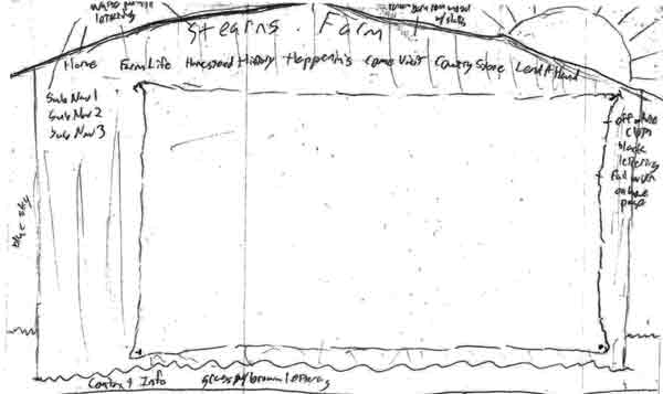
Next up I made the back of a red barn. The roof would hold the title (probably no room for a logo) and the main navigation in white paint-like lettering. The sub navigation would be in a side bar with the same lettering. The main content would be on a big off white type cloth nailed to the barn. The footer would again be the grass. A sun was featured over the roof to add a little brightness.
Finally, I came up with a variant of the barn door idea with something inside. A farmer would be standing with a pitch fork forking a large, squarish pile of hay. The hay would hold the main content and the farmer would have the accordion side navigation on his back/side. This version of the door had a cloth banner nailed across the inside top of the door with just the logo and title. This one seemed very kiddy to me though, would probably only appeal to kids.


